Notice Tracker.
AI-augmented platform for managing GST notices at scale.
The chaos before.
Indian enterprises were managing thousands of GST notices across emails, spreadsheets, and a government portal that was never designed for compliance teams. A single missed deadline could mean penalties in lakhs, sometimes crores.
The portal returned communications. Teams needed cases. There was no priority signaling, no chronological view, no team workflow. Just a list of documents with cryptic reference IDs, scattered across months.
We did not initially plan to build a notice product. Our enterprise customers pulled us toward it. They kept asking for the same thing in different words: a way to stop losing money to deadlines they could not see.
Understanding the chaos.
Before we talked to customers, I spent a week inside the government’s GST portal. Mapped every screen, every workflow, every data field. I needed to know what the system actually returned, not what customers thought it returned.
Then we ran customer interviews. We asked questions in three categories:
Process and scale
What did their current workflow look like? How were their teams structured? What was their monthly and annual notice volume?
Prioritisation and impact
Which notices were most common? Which carried the highest financial risk? What mattered more, volume or value at stake?
The human element
How did notices feel? What did anxiety, frustration, and pressure look like in their teams when a notice arrived?
Most products would ask the first category. The second and third are where the real insight came from. Customers did not want a tool that organized documents. They wanted a tool that protected them from financial damage.
We ran the research as three two-week sprints, with the engineering lead and product head in every review. The IA locked before we touched UI.
The breakthrough.
Our deepest analysis of the government portal revealed its single greatest flaw. The portal returned a dump of communications without a clear chronological trail. Multiple updates related to the same legal matter could appear as separate items with different reference IDs, scattered across months.
A case is not a document. A case is a conversation between a tax authority and a taxpayer, often spanning multiple stages: Intimation, Notice, Order, sometimes higher courts. The government’s reference IDs were document IDs. We needed case IDs.
So we built the entire product around a single insight: every screen and every interaction model anchors to a stable Case ID.
This single decision simplified the entire information architecture. The dashboard could group by case, not by communication. The case list could prioritize by case status, not by document type. The case detail page could show a true chronological history. The AI layer, when we added it later, could summarize across the case lifetime rather than per document.
The Case ID became the spine. Every other design decision flowed through it.
Three pages, three personas.
Our research surfaced three distinct user types, each with a different job to be done. The product had to serve all three, but they needed different views.
The CFO needed a 30-second risk view. Total financial exposure, what is overdue, what is time-critical. No need to see individual notices. They just need to know how worried to be.
The Tax Head needed to triage. Which entities carry the most risk? Which team members should handle what? How is the pipeline looking?
The Analyst needed to do the work. Read the notice, gather the data, draft the reply. Maximum context on a single screen, minimum hunting.
I designed three pages, one for each role.
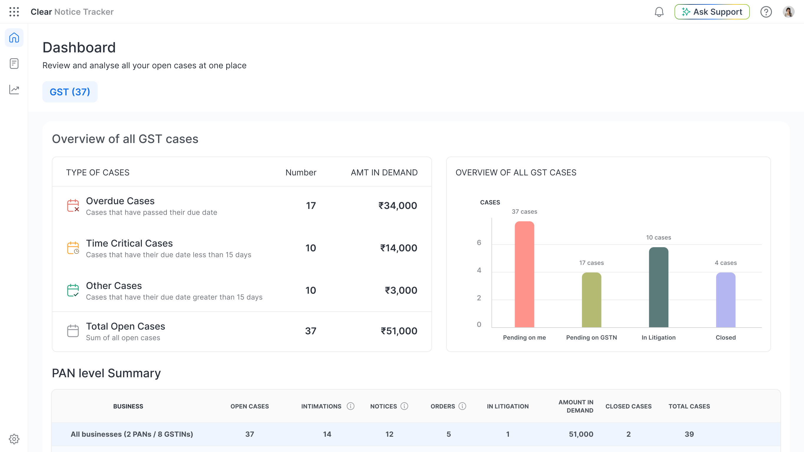
Total financial demand at the top. Time-sensitive buckets next: Overdue, Time-Critical, Other. A workflow status bar chart showing where cases are stuck (Pending on Me, Pending on Government, In Litigation, Closed). A PAN-level summary table that identifies which business entities carry the most risk, broken down by stage.
This page exists to be read in 30 seconds. Everything that takes longer than that to understand was cut.
An inbox-inspired layout. New cases in bold, viewed cases grayed out. Overdue dates marked in red, impossible to miss. Smart filters consistent with the dashboard’s buckets, so a manager moving from one page to the other carries the same mental model.
The interaction patterns borrow from email because tax heads already know how to use email. We did not need to teach them a new system.
Three columns. Context locked left. Chronological timeline center. Collaboration hub right.
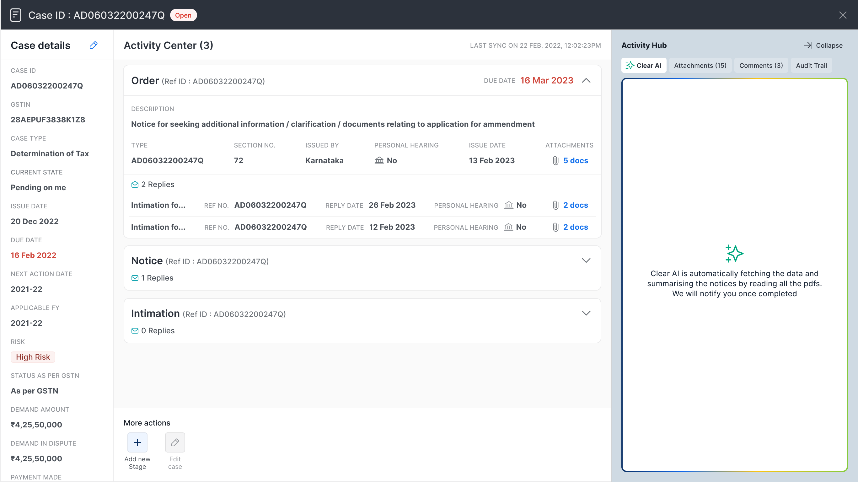
The center column is the heart of the product. It presents the complete case history in reverse chronological order, grouped by stage. Each stage is a collapsible card. By default, only the latest stage is open. Older stages stay tucked away until needed.
I added a small detail: when a stage is collapsed, the envelope icon next to “Replies” shows as closed. When you expand it, the envelope animates open.
It is the smallest possible touch of personality. It also reinforces the interaction without text instructions.
Underneath those three screens sat one structure. Every regime, every notice, and every system layer resolved to the same Case ID.
The decision to narrow.
We launched. The product worked. Customers loved it for GST notices specifically.
Then we extended to Direct Tax notices. We assumed the workflow would translate. It did not.
Within three months, the data was unambiguous. Direct Tax usage was low. Support tickets revealed a fundamental workflow mismatch. The notice formats were different. The deadline structures were different. The user expectations were different.
I led the call to stop active development on Direct Tax. We repositioned it as a sales-assist tool, valuable for opening doors with prospective customers, but not draining engineering resources to maintain as a primary feature.
Two of the three regimes in that architecture came off. Direct Tax moved to sales assist, GST got the depth instead.
Then I made one more decision that turned out to matter: we renamed the product.
Implied a broad scope
Encoded a narrow promise
The rename was not marketing. It was strategic. Management implied a broad scope. Tracker encoded a narrow promise. The new name told customers what we were and what we were not.
Engagement on core GST features rose. Off-track feature requests dropped. Sales conversations got cleaner because the name did the qualification work.
Adding intelligence.
Tracking solved the organization problem. The remaining problem was comprehension.
Government notices arrive as inconsistent PDFs, often in regional languages, with no standard format. Reading them is slow. Misreading them is expensive.
We added an AI layer with three capabilities:

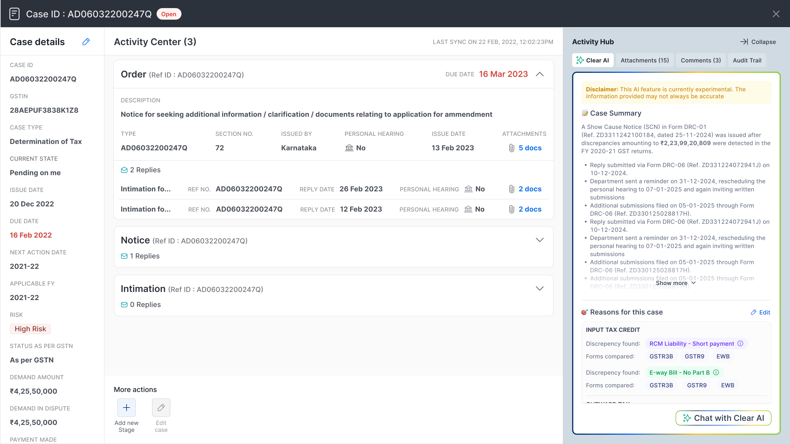
AI Summaries. A plain-language explanation of what the notice is actually demanding, generated from the PDF content.
Reason Extraction. Automatic identification of the specific reason for the notice. Was it a mismatch? A late filing? An ITC dispute? Surfaced in structured form.
Structured Parsing. The government portal does not return these fields. Users had to read every PDF to find the demand amount, the relevant tax section, the actual due date. We extracted these upfront and populated them directly in the case list table view, so the team could triage at a glance instead of opening every document.
We shipped it in phases. Early Access first, with a small cohort of real customers feeding us their actual notices for training. General Availability followed only when extraction accuracy crossed a threshold where the AI felt invisible.
The principle for the AI rollout was simple: ship as a capability, not a demo. Trust gets earned through accuracy on real data, not through marketing screenshots.
What I took from this.
Find the canonical key.
For Notice Tracker, it was the Case ID. Every complex domain has one. The stable identifier that makes everything else coherent. Finding it is the difference between a feature and a product.
Names defend roadmaps.
Renaming Management to Tracker did more for product clarity than any roadmap document. The name encodes the promise. Encode the right promise.
Discipline beats demand.
Customers asked for Direct Tax. Data said it would not work. Killing it was harder than building Notice Tracker, and more important. The thing that ships well is rarely the thing that was loudest in the meeting.
Design for being wrong.
The AI extraction is usually right and occasionally not. The design work was not making it perfect. It was making sure a user could tell what the government sent from what the system read.
What it added up to.
From tracking to litigation.
Notice Tracker covers the first chapter of a tax dispute: receive, understand, reply on time. For most enterprises, the story ends there.
The ones that escalate are different. Disputes turn into hearings, hearings into appeals, sometimes years of proceedings. The financial exposure is larger. The workflows are longer. The same Case ID still anchors everything.
That’s what’s coming next. We are extending the platform into the full litigation lifecycle as a dedicated product, CCC Litigate. Same spine, deeper domain, longer time horizons.