A zero‑to‑one story that redefined how India’s largest enterprises track government tax notices.
Clear’s Notice Tracker is a B2B SaaS product that unifies, tracks, and prioritises GST notices across entities and GSTINs so that deadlines are never missed again. Before launch, enterprises stitched together emails, spreadsheets, and a hard‑to‑navigate government portal. an expensive recipe for missed replies and penalties
Impact
In just 10 weeks, we delivered a product that achieved a 90% success rate in notice tracking, 85% user adoption, and generated ₹2.3 Cr in annual revenue. The product quickly became an indispensable tool for over 100 enterprise clients.
My Role
As the Lead Product Designer, I owned the end-to-end product strategy, from initial research and prototyping through to final UX/UI design. Following the successful launch, I transitioned into the Product Manager role, leading the post-launch strategy, driving the AI roadmap, and making key data-driven decisions to scale the product's success.
Team
Founder, Product Head, Leader of Sales, Engineering Head
Emphasize
Problem Identification
The Spark: A Growing Chorus of Customer Demand
We didn't initially plan to build a notice product. Instead, our customers pulled us in that direction. A growing number of enterprise clients began demanding a tool to track government notices. They described a chaotic, high-stakes environment where missing a single deadline, buried in an email or a clunky government portal, could result in crippling financial penalties. This clear, repeated demand from our core user base signaled a critical gap in the market we were perfectly positioned to solve.
Understanding the Chaos: Initial Research & Government Portal Analysis
Before engaging customers directly, we started by deconstructing the existing landscape. We analyzed the government's GST portal to understand the official workflow and its inherent challenges. We mapped out what information was available, how it was presented, and identified the core reasons why it was such a major challenge for large enterprises. This initial analysis gave us a foundational understanding of the system's flaws and the "nuisance" our customers were experiencing daily.
Brainstorming sessions with the team
Into the Trenches: Deep-Dive Customer Interviews
With a baseline understanding, I led a series of in-depth customer interviews to move from assumptions to empathy. The goal was to step directly into their shoes. I focused on uncovering not just the "what", but the "why" and "how".

Process & Scale
What were their current processes? How were their teams structured? What was the monthly and annual volume of notices they received

Prioritisation & Impact
Which notices were most common? Which carried the highest financial risk? We needed to understand what truly mattered to them: the sheer volume of notices, or the financial value at stake

The Human Element
We also explored the human side of the problem by asking about the raw emotions a notice triggered for their team, such as anxiety, frustration, and pressure.
These conversations were invaluable. They confirmed the immense need for a solution and gave us a precise, human-centered understanding of the problem we needed to solve.

FROM INSIGHTS TO STRATEGY
Deconstructing the Domain
With our user research complete, the next critical step was to synthesize our findings and deconstruct the complex domain of tax compliance. We needed to translate the raw data from our interviews into a coherent strategy and a clear product blueprint. This process involved defining our users, mapping their journey, and pinpointing the single insight that would anchor our entire solution.
Defining the Users: A Spectrum of Needs
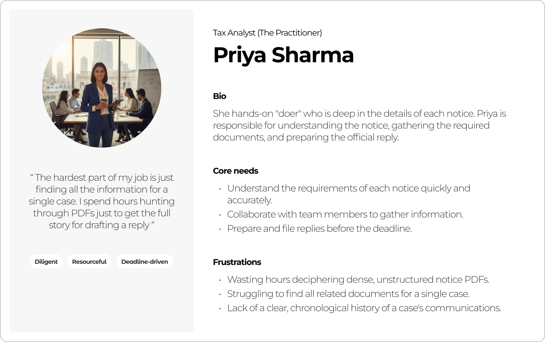
Our research clearly showed that "the user" was not one person, but a team with distinct roles. We identified three primary personas, each with a different job-to-be-done. Our product had to serve the needs of the entire spectrum.
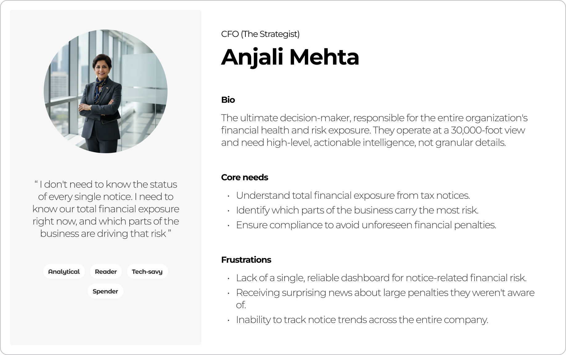
- The Strategist (The CFO): Needs a high-level, 30,000-foot view. Their primary concern is understanding the company's total financial risk across all entities and tracking key metrics on a monthly or yearly basis.
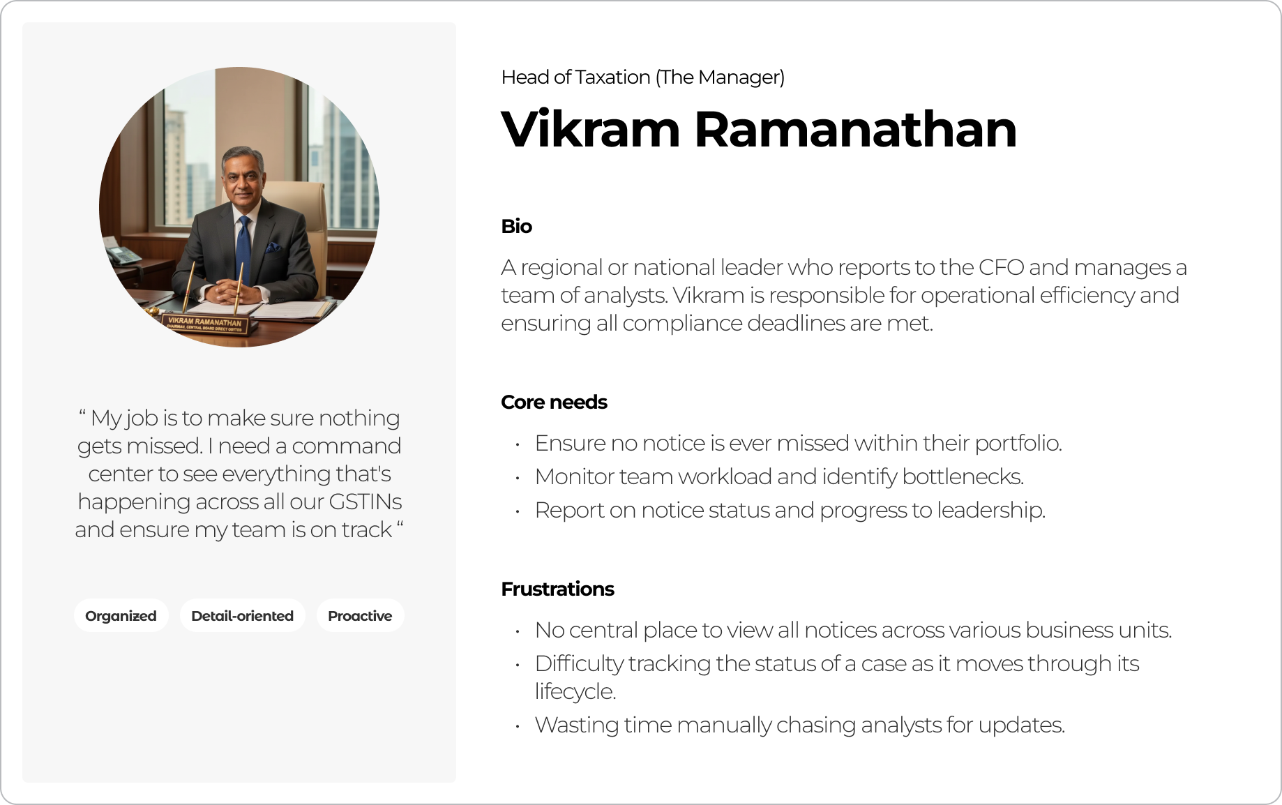
- The Manager (The Tax Head): Oversees multiple business units (GSTINs). They are responsible for team efficiency and need to track the status and priority of notices at a regional or PAN level.
- The Practitioner (The Analyst): The hands-on team member who is deep in the details. They are responsible for understanding the notice, gathering relevant data, and executing the reply.
Mapping the Journey: The Notice Lifecycle
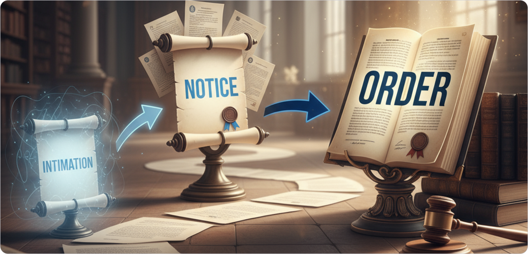
To build an intuitive product, we first had to understand the natural lifecycle of a notice. In consultation with a domain expert, we analyzed dozens of real notices and mapped their progression. We learned that a notice is not a single event, but a "case" that evolves through predictable phases: from an Intimation, to a Notice, to an Order, and potentially all the way to higher courts.
The Breakthrough: A Core Design Insight
Our deepest analysis of the government portal revealed its single greatest flaw and, in turn, our biggest opportunity. We discovered that the portal provides just a "dump of communications" without a clear, chronological trail. Multiple updates related to the same legal case were often listed as separate, new items with different reference IDs. This fragmented the history of a case, making it nearly impossible to track coherently.
This led to our core design insight which became the foundation of the entire product. We realized we had to anchor the entire experience to a single, stable Case ID.
This principle simplified the Information Architecture of the product significantly. By grouping all related communications under one unique identifier, we could provide the clarity and chronological order that users desperately needed.
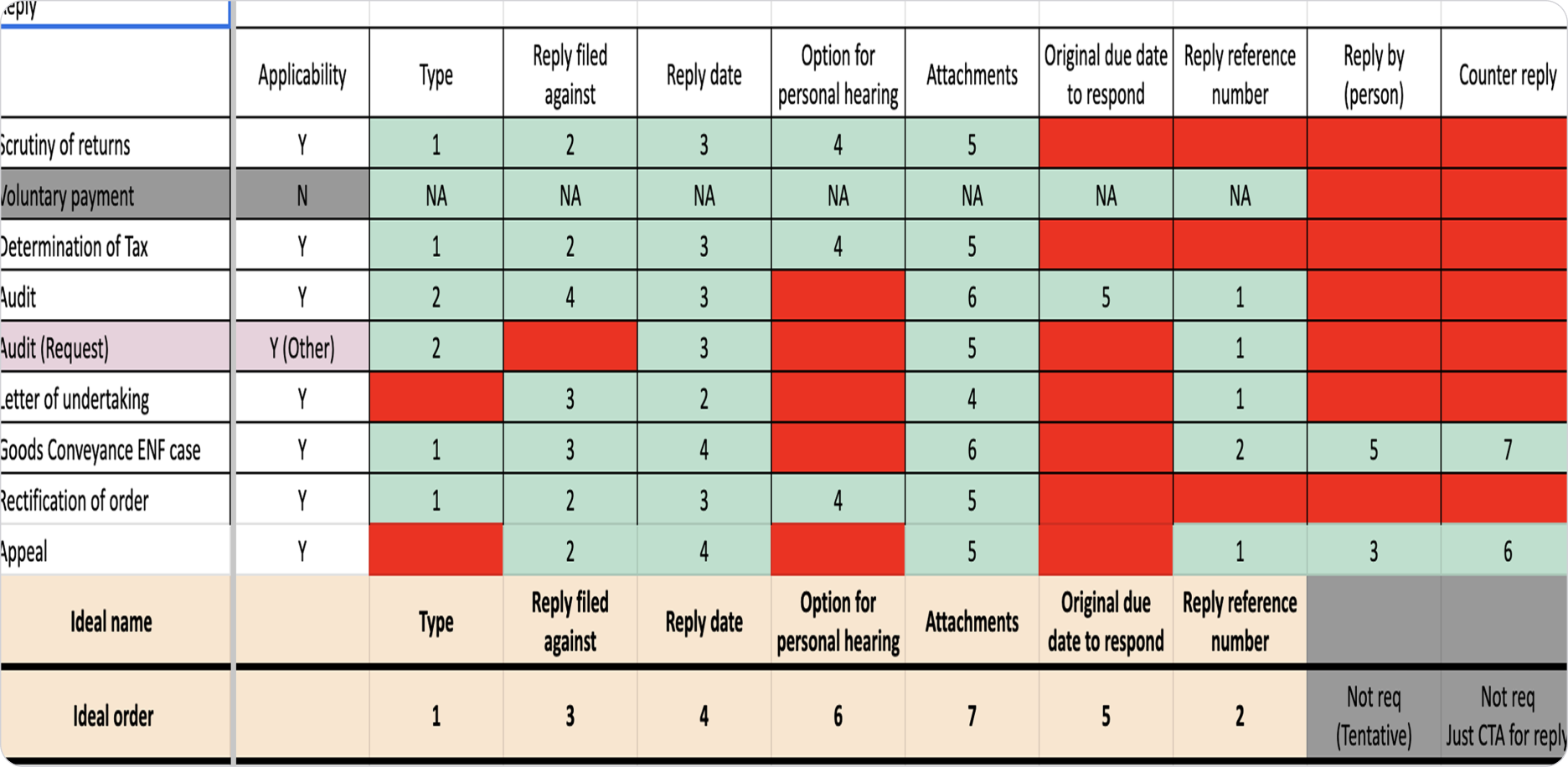
Building the Blueprint: Structuring the Information
With the Case ID as our anchor, we began the meticulous work of building our product's data model. We mapped every detail the government provides for various notices and replies into a structured format. This exercise helped us categorize all information into two clear levels:
- Case-Level Details: Information that applies to the entire case.
- Notice/Reply-Level Details: Information specific to an individual communication within that case.
This foundational work was crucial. It ensured our product would be both comprehensive and incredibly easy to navigate, directly solving the fragmentation problem of the government portal.
FROM BLUEPRINT TO PROTOTYPE
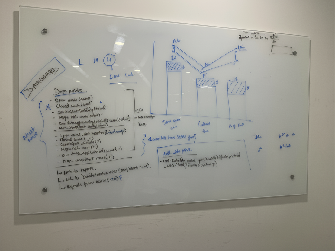
Design Exploration & Iteration
With our core insight and information architecture defined, the next phase was to translate that blueprint into a tangible, user-centric design. This wasn't about finding one perfect solution on the first try; it was about exploring possibilities, gathering feedback, and iterating toward clarity.
Establishing Guiding Principles
I started the design process by establishing a set of clear principles that every iteration had to follow. These were our non-negotiables, derived directly from our research and strategic goals.
- Persona-Driven Design: Every screen had to effectively serve the distinct needs of the Strategist, the Manager, and the Practitioner.
- Anchored on the Case ID: Our core insight was the foundation. The Case ID had to be the central organizing principle for all data and interactions.
- System Consistency: The solution needed to feel like a natural part of the Clear product suite. We adhered to the existing design system to ensure a consistent hierarchy, design language, and familiar UX interactions for our users.
Building for Speed and Clarity
Our goal was to move quickly and get the product live as soon as possible. To achieve this, I drove a series of rapid design sprints. We focused on quick, iterative loops of design and feedback, primarily with internal stakeholders who had deep domain expertise. The first phase focused entirely on getting the Information Architecture right, ensuring the product was simple to navigate before we moved to detailed UI.
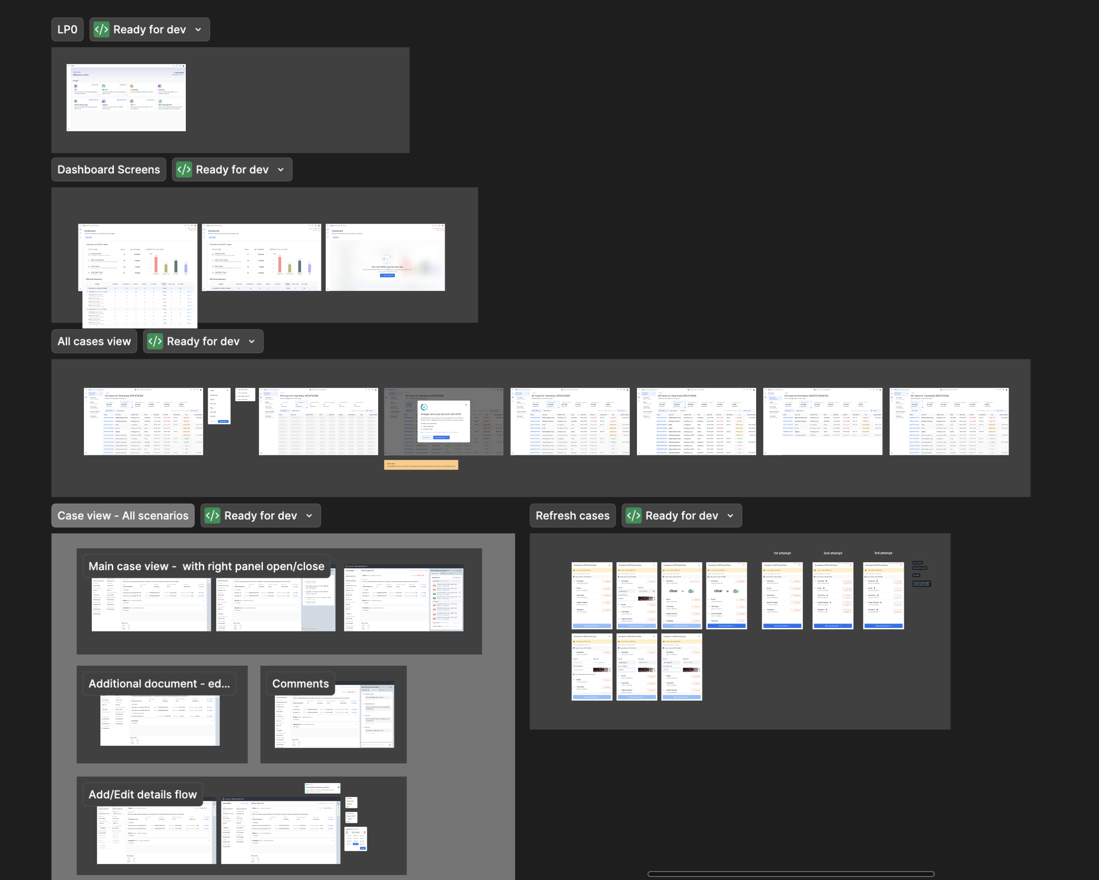
THE SOLUTION
A Three-Page Journey to Clarity
The final solution, born from rigorous research and rapid iteration, was a simple yet effective three-page product. The entire experience was engineered to mirror the distinct mental models of our user personas, creating a seamless journey from a high-level strategic overview to the most granular details of a single case.
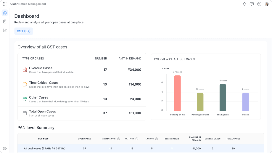
The Dashboard: The 30-Second Risk Assessment
This page was designed for the CFO (The Strategist). The core principle was to distill the entire organization's risk into a single screen that provides actionable intelligence in seconds, allowing them to understand the complete picture without clicking through multiple pages.
- Immediate Financial Triage: The design leads with the total financial demand, then breaks it down into intuitive, time-sensitive buckets ("Overdue," "Time-Critical"). This empowers leaders to prioritise by financial impact, not just case volume.
- Clear Operational Status: A simple bar chart visualises the workflow status ("Pending on Me," "Pending on Government," etc.), providing a clear and immediate view of any operational bottlenecks.
- Risk Concentration by Stage: The PAN-level summary table instantly identifies which business entities carry the most risk. Critically, it also breaks down the open cases for each entity by their current stage (Intimations, Notices, Orders). This provides a deeper layer of insight, telling leaders not just how many cases are open, but the nature of that work, making the picture perfectly clear.
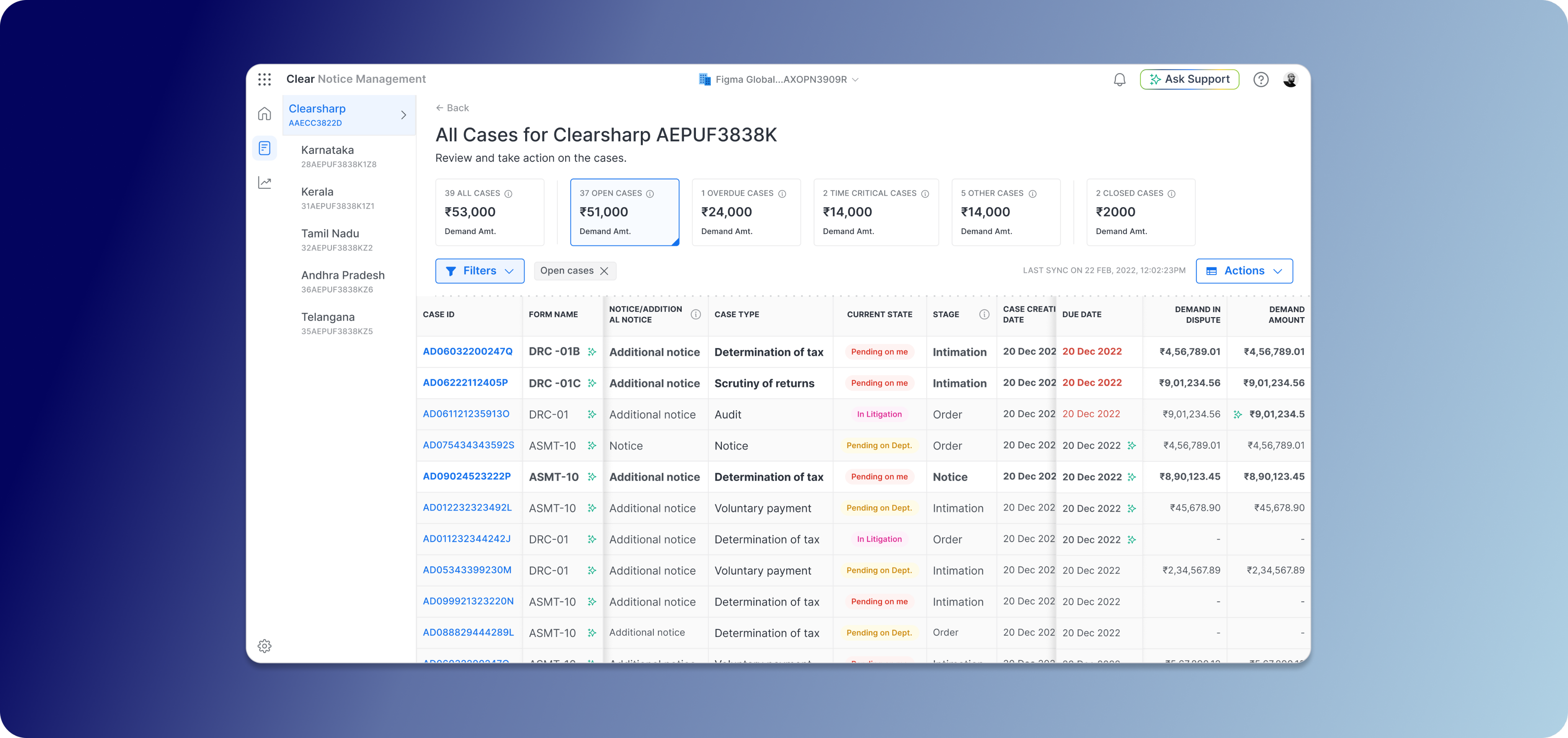
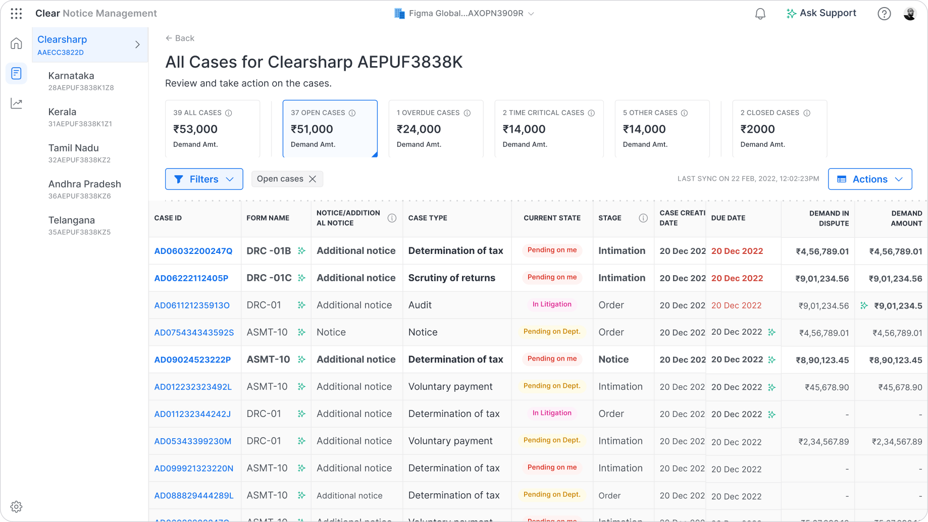
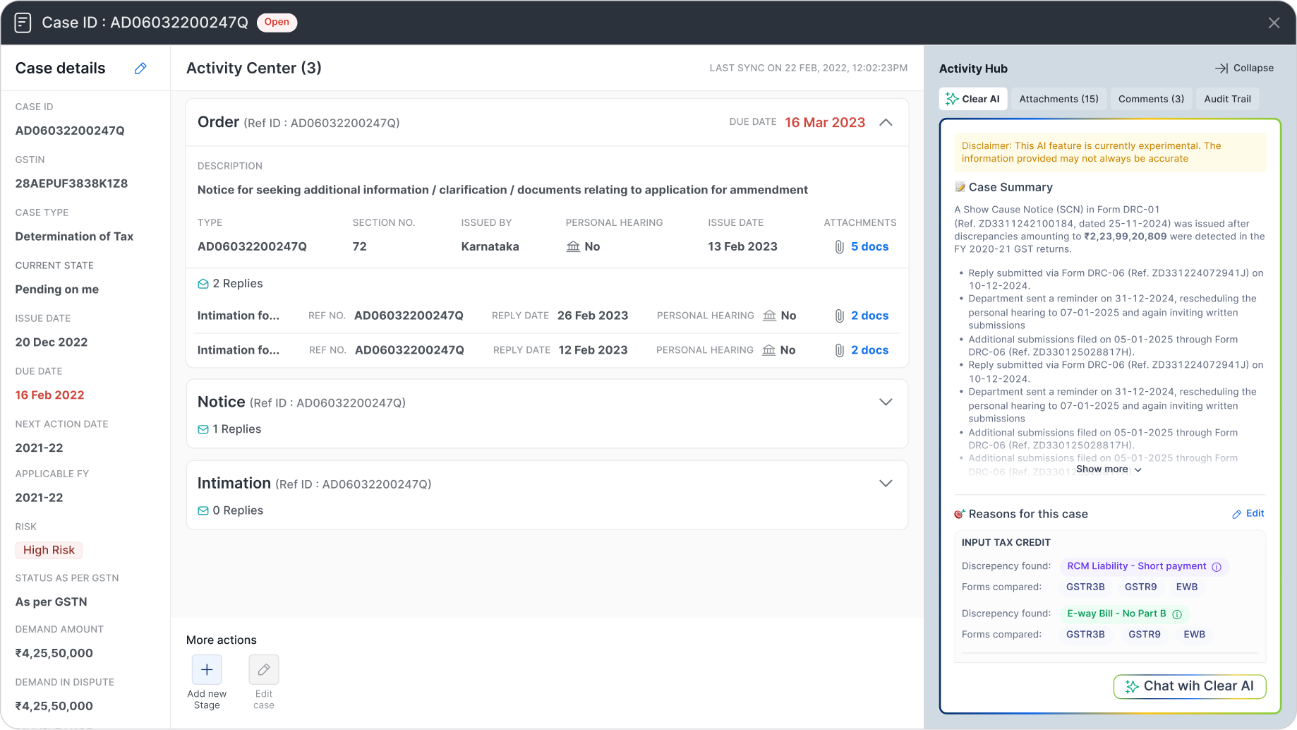
The Case Details: The Practitioner's Workspace
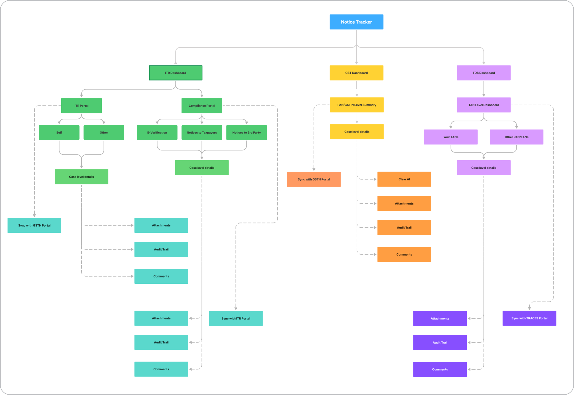
This is the deep-dive workspace, meticulously crafted for the Analyst (The Practitioner). I designed a three-column layout to provide maximum context and functionality on a single screen, eliminating the need to hunt for information.
- Anchored on Clarity: The entire table is structured around our core insight, the Case ID, providing a stable source of truth. Critical information like overdue dates is marked in red, ensuring the most urgent items are impossible to miss.
- Intuitive Prioritisation: I implemented a visual cue inspired by a familiar mental model: the email inbox. New or unread cases are highlighted in bold, while viewed cases are grayed out. This subtle pattern intuitively guides the user's attention to what's new and needs action, reducing cognitive load.
- Consistent Smart Filters: Powerful filters allow managers to instantly slice the data by the same status categories as the dashboard ("Overdue," "Time-Critical"), providing a consistent experience while allowing for deeper, GSTIN-level investigation.
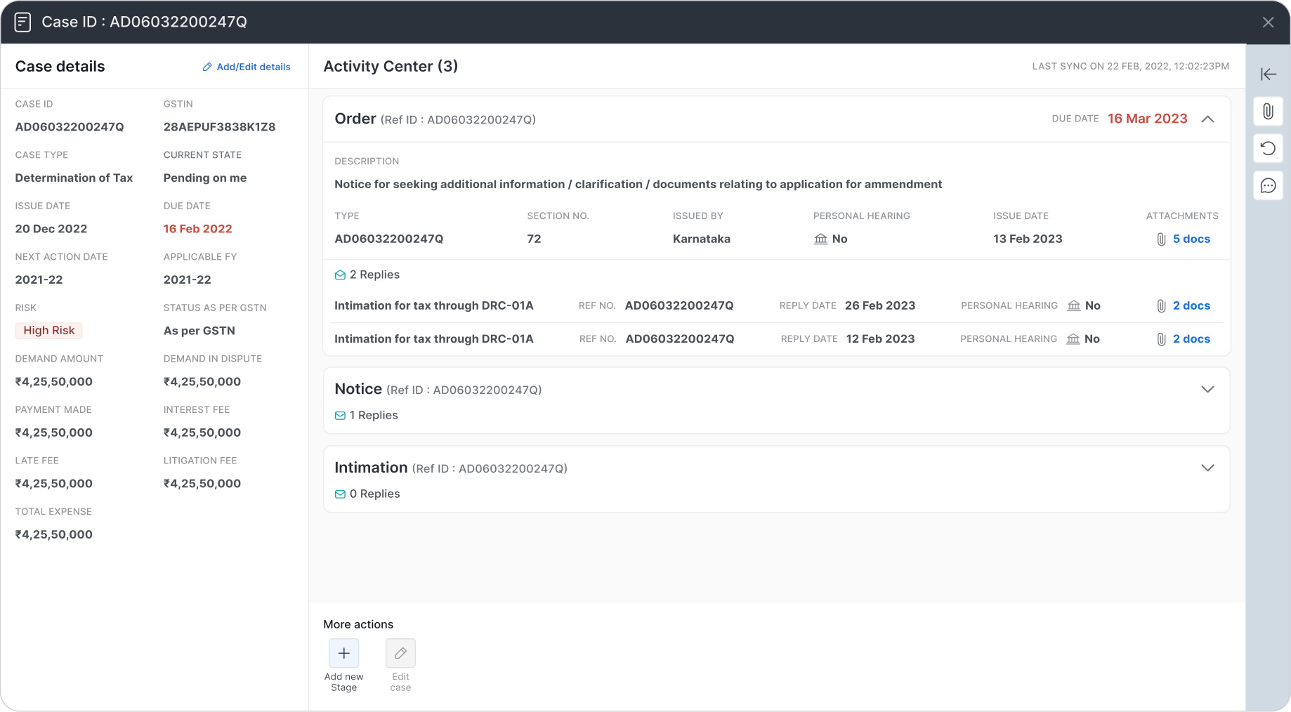
The Case Details: The Practitioner's Workspace
This is the deep-dive workspace, meticulously crafted for the Analyst (The Practitioner). I designed a three-column layout to provide maximum context and functionality on a single screen, eliminating the need to hunt for information.
- The Timeline (Center Column): This is the heart of the page and the direct solution to the government portal's biggest flaw. The "Activity Center" presents the complete history of the case in a clean, reverse chronological order.
- Managing Complexity with Care: Recognising this page could be overwhelming, I designed each stage (Intimation, Notice, Reply) as a collapsible card. By default, only the latest stage is open, dramatically decluttering the view and focusing the user on the most recent action.
- A Touch of Craft: To add a small element of design flair and reinforce the interaction, I added a micro-interaction to the "Replies" icon. When a card is collapsed, the envelope icon is closed. When the user expands it, the envelope icon subtly animates to an open state, providing a delightful and intuitive visual cue.
- The Context & Toolkit (Side Columns): All essential case details are locked in the left column for stable reference. The right column is the collaboration hub, containing all attachments organised by stage, a full audit trail, and a comments section for seamless team communication.
POST-LAUNCH: STRATEGY & EVOLUTION
Pivots, Positioning, and Payoffs
Launching a product is the beginning, not the end. After the successful rollout of the GST Notice Management product, we entered a critical phase of learning and adaptation. This period was defined by listening to our customers, analyzing the data, and making tough, strategic decisions that would ultimately define the product's long-term success.
The Data-Driven Pivot
Following strong demand, we quickly expanded to include Direct Tax notices. However, post-launch data revealed a clear disconnect: usage was low, and support tickets showed a fundamental mismatch with user expectations. The workflows were simply different.
Faced with this evidence, I led the decision to pivot. We ceased active development on the Direct Tax feature and repositioned it as a "sales-assist" tool, preserving its value as a deal-unlocker without draining engineering resources.
The Power of Positioning
To further clarify our value, we renamed the product from "Notice Management" to "Notice Tracker." This simple change was a strategic move that powerfully communicated our core promise. The results were immediate: user engagement with the core GST features soared, and distracting feature requests decreased, allowing us to solidify our product-market fit and move confidently to General Availability.
THE RESULTS
Impact
Our focused approach, from deep research to strategic pivots, delivered exceptional and measurable results. The decision to sharpen our value proposition around tracking was vindicated by the numbers, solidifying the product's market fit and transforming it into a significant revenue driver for the business.
100+
Enterprises
85%
User Adoption
95%
Success Rate
2.3 Cr
Annual Revenue
This success proved we had solved a critical pain point. But we knew that simply tracking notices was only the beginning. The next frontier was to move beyond organizing information and start accelerating comprehension. This led directly to our most powerful strategic investment.
BEYOND TRACKING
AI Augmentation: From Data to Decisions
The biggest remaining challenge for our users wasn't just finding a notice; it was the time-consuming and error-prone process of manually deciphering it. Government notices are notoriously inconsistent, arriving as unstructured PDFs, often in regional languages, with no standard format.
To solve this, we introduced a layer of AI-powered intelligence, transforming the product from a system of record into a decision-making engine.
The Solution: AI-Powered PDF Intelligence
We built an AI pipeline that could read these complex notice documents and provide immediate value through:
- AI Summaries: Providing a concise, plain-language summary of the notice's core message.
- Reason Extraction: Automatically identifying and highlighting the specific reason for the notice.
- Structured Data Parsing: Pulling key details like demand amounts, relevant sections, and dates into structured fields for filtering and reporting.
The Rollout: Building Trust Through Partnership
Shipping AI isn't just a technical challenge; it's a trust-building exercise. We adopted a phased Early Access (EA) to General Availability (GA) rollout model. This allowed us to work with a cohort of initial customers, using their real-world notices to train our models and gather direct feedback. This field-led process was critical for steadily improving extraction accuracy and earning the trust of our users.
FINAL THOUGHTS
Key Takeaways
This project was more than just a product launch. It was a masterclass in product strategy, user centricity, and the courage to pivot. The success of Notice Tracker can be distilled into four core principles that I now carry into every new challenge.
A Great Tracker Beats a Mediocre Litigation Tool
Our biggest strategic win was having the discipline to say “no”. Customers will always ask for more, but our data showed that solving one problem exceptionally well delivers far more value than solving many problems poorly. Clarity beats feature bloat.
Name the Boundary to Defend the Roadmap
The simple act of renaming the product from Notice Management to Notice Tracker was a powerful strategic decision. It aligned customer expectations with our core value. It also dramatically reduced off track feature requests and freed our team to focus on what truly mattered. Your product's name must encode its promise
The Canonical Key is Everything
Our early, obsessive focus on identifying the Case ID as the single, unifying anchor for our entire product was the most important technical and design decision we made. This canonical key unlocked coherence everywhere, from the user interface to the backend architecture. It made a complex domain feel simple.
Ship AI as a Capability, Not a Demo
AI only earns trust when it solves real problems with real data. Our phased Early Access to General Availability rollout was critical. By partnering with customers and iterating on their actual documents, we transformed our AI features from a cool demo into an indispensable, field tested capability that delivered measurable accuracy and value. Data, not demos, is how AI wins.